Generating conversions to a highly optimized landing page can provide real value to a page dedicated to the end user.
This is important because a landing page tailored to the needs of the customer can increase conversion up to 300%.
Now every marketer wants to increase conversions, but you can’t just throw up any page and hope for the best. It takes strategy and creativity. Follow these tips in this blog to give yourself the best chance for success.
Establish Your UVP
Create a value-driven UVP (Unique Value Proposition) and build your landing page around it.
UVP is the thing that sets you apart from the competition and the reason why people will pick you over everyone else.
You can use UVP to create headlines, images, and copy that resonates with your target audience.
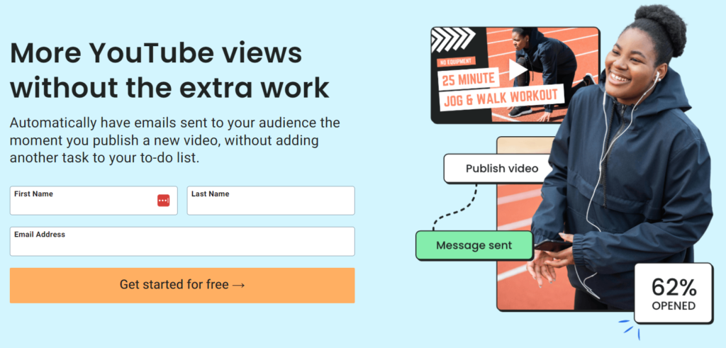
Example of a landing page using UVP:
In this example, AWeber created a landing page demonstrating UVP that targets Youtubers. The headline addresses a need for this audience, while the image highlights the ways AWeber helps increase video views.
Keep The Design Clean and Simple
Most landing pages suffer conversions because there’s just too much going on. Approach landing page design with respect for the visitor.
Everything about your landing page should be geared towards getting the user to convert. This means removing anything that might draw their attention away from your offer.
White space is something to keep in mind. Sometimes, what you leave off the page is just as powerful as what you include. White space removes confusion and gives the brain space to think. It also forces the eyes to focus on the more important elements of your page.
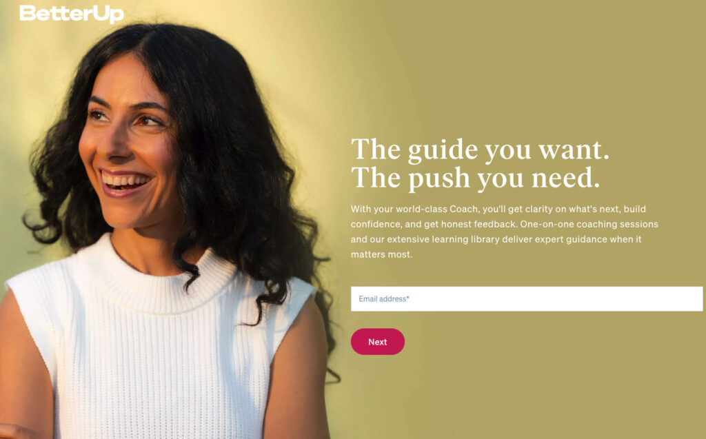
Example of a clean and simple landing page:
BetterUp designed a simple, yet effective landing page. While not a white background, the design of this landing page gives you plenty of ‘breathing space’, whilst avoiding overwhelm.
Create Headlines That Bring Results
80% of visitors will read the headlines, that means only 20% will read the rest of your copy, so it’s important that you nail this part of your landing page.
Now, your headline needs to capture visitors attention immediately and convey your unique value proposition. If it’s vague or doesn’t convey a benefit, users will just leave.
Once the headline grabs the visitors attention, you can reinforce your message with images and copy that persuades them to stay.
Your can go into more detail with the main headline, but you should limit it to no more than a few lines of persuasive copy.
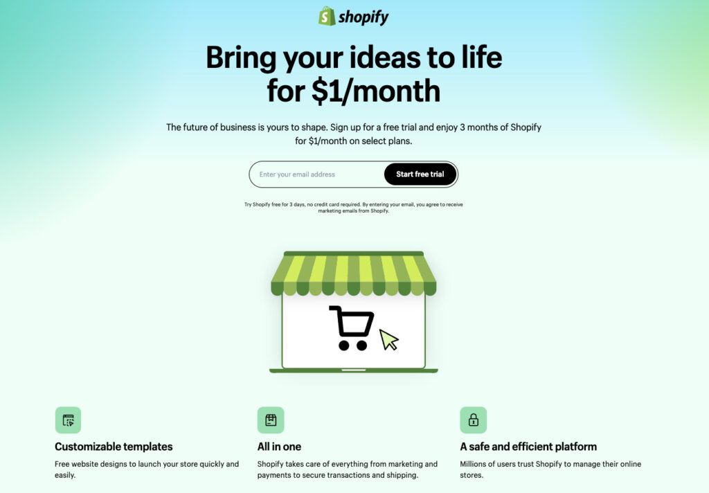
Example of a landing page using a persuasive headline:
I love this headline from Shopify – “Bring your ideas to life for $1/month”. This headline will definitely resonate with their audience. Also the low price point in the headline eliminates friction a visitor may have to signing up.
Grab Attention With Relevant Images
Images play an important part to increasing conversions on landing pages. An image is the first thing a visitor will see before they read the headline.
The human brain processes images 60,000 times faster than text, so what the visitor sees will influence their decision to take an action.
Like headlines, images grab attention. Make them relevant to your offer.
Keep in mind, that you don’t have long to make a good first impression. Make sure images are high-quality and large enough. Keep you’re images unique – you don’t want to show visitors something they may have already seen.
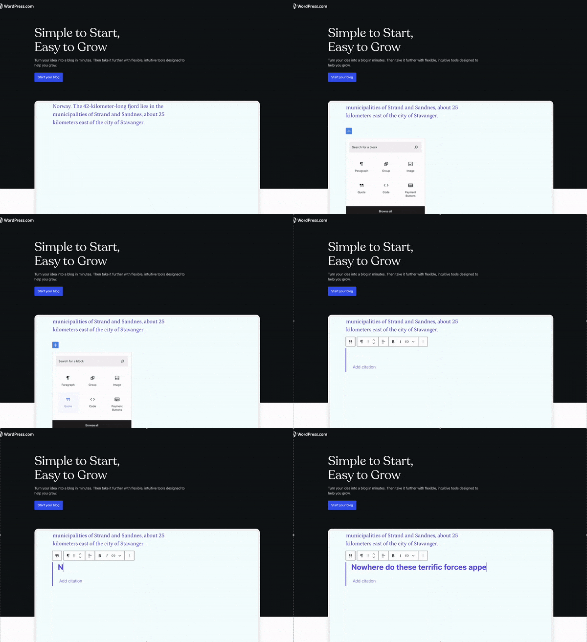
Example of a landing page using an image to grab attention:
WordPress goes a step further by showing a GIF of their platform in action.
Create Strong Call-To-Actions
Every landing page you design should be for visitors to notice and take an action.
The golden rule for form submissions should have a unique and compelling CTA (call-to-action).
If your form asks for too much information, visitors may not bother. And if your call-to-action isn’t personalized enough or it’s difficult to find, you jeopardize the chances of converting visitors into the desired action.
Here are a few things to keep in mind when creating your call-to-actions:
- Always use a button. People are conditioned to expect a button, so don’t confuse visitors.
- Use colours that attracts the eye.
- Use actionable words (e.g. ‘Buy Now’, ‘Download Now’, etc.)
Call-to-actions actually do play an important part for landing pages that convert at a high rate. You don’t want to make visitors guess on what to do next.
Think about your goal with your landing page. Whatever your desired action is, the call-to-action should be obvious and ready to capitalize on this goal.
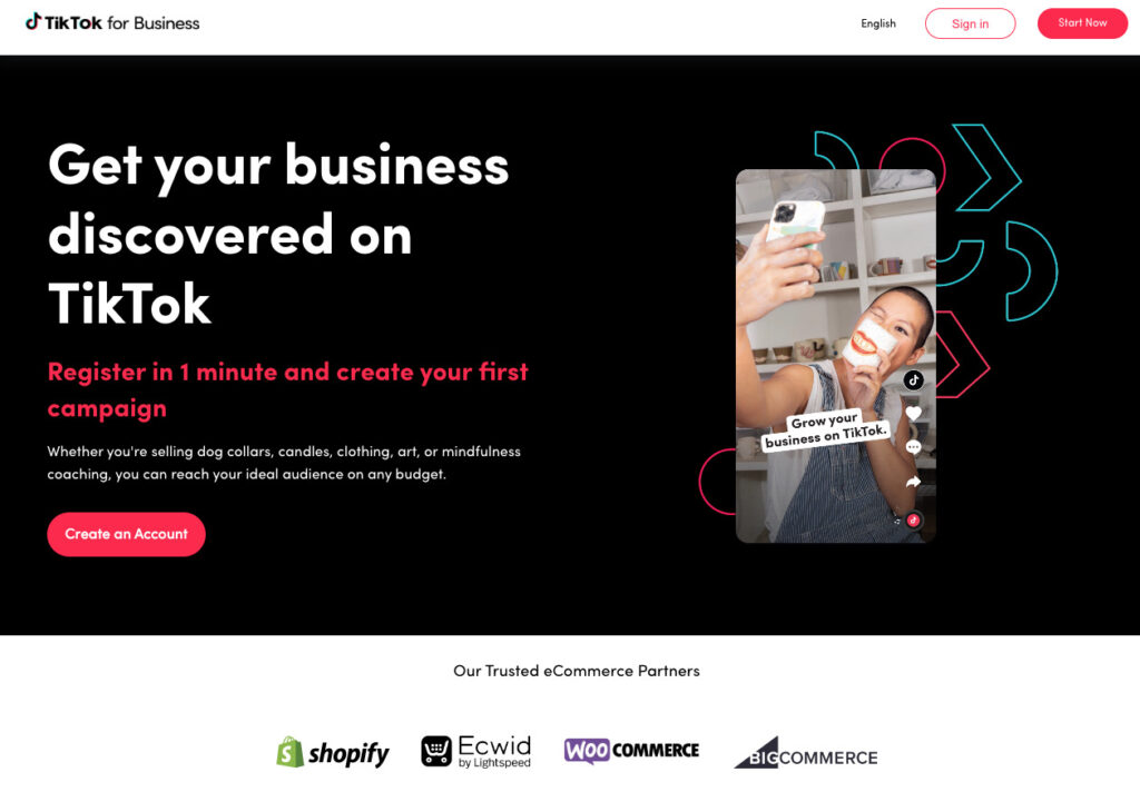
Example of a landing page using a strong call-to-action:
TikTok checks all the boxes. It’s clear with the action they want the visitor to take, the red against a black background really makes it pop, and it uses an action word.
Add Social Proof
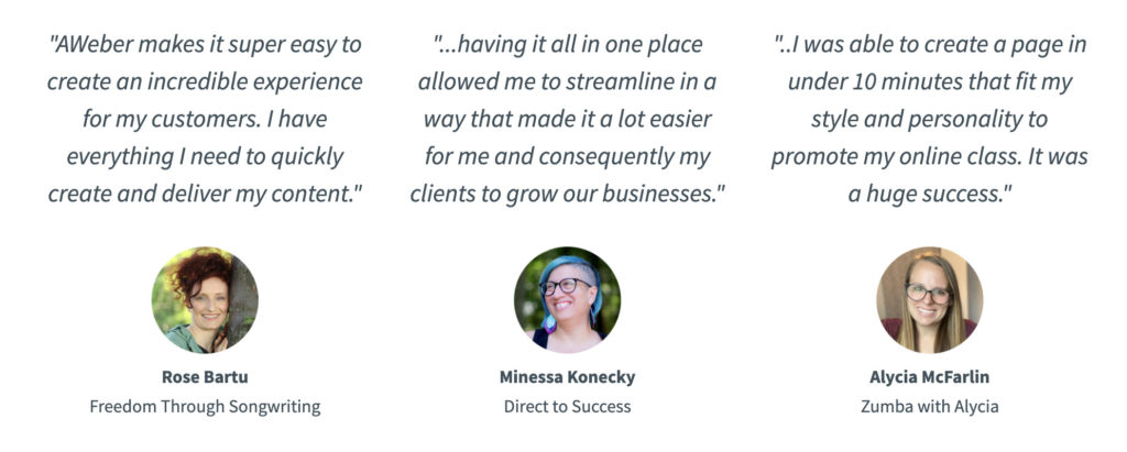
Adding social proof is a great way to build trust and credibility, and it gives visitors more confidence when making a decision.
Did you know that 91% of shoppers read online reviews before making a purchase?
If you don’t have testimonials yet, it’s easier than you think. A simply way to start is by asking in an email or social media platforms.
Like AWeber…
High Converting Landing Page Templates
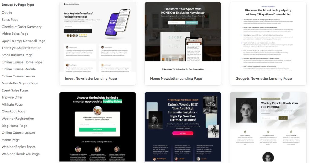
You don’t need to start from complete scratch to create a landing page that converts. You can use a landing page builder that already has a collection of high converting templates.
Start with a template that closely aligns with your goals, then customize it to reflect your branding and messaging.
You can get high converting landing page templates with OptimizePress.
These templates are crafted to skyrocket your conversion rates and leave a lasting impression on your audience. You can also check out over 100+ landing page templates.
Now it’s your turn…
As you design your landing page, be sure to reflect on what’s working and what isn’t from this blog. Then test new ideas and tactics to continue improving your conversion rates.
Once your landing page starts converting, it’s a sign that it’s working, and people are putting their trust in you to deliver on what you say. Repay that trust by emailing content that adds value and personalized offers. Once a person has subscribed to your email list, use it to your advantage.
As always, thanks for reading!

Carl Davies
P.S. Did you find this post about “How to Create Landing Pages That Convert” helpful? If so, please share the love by sharing and commenting.